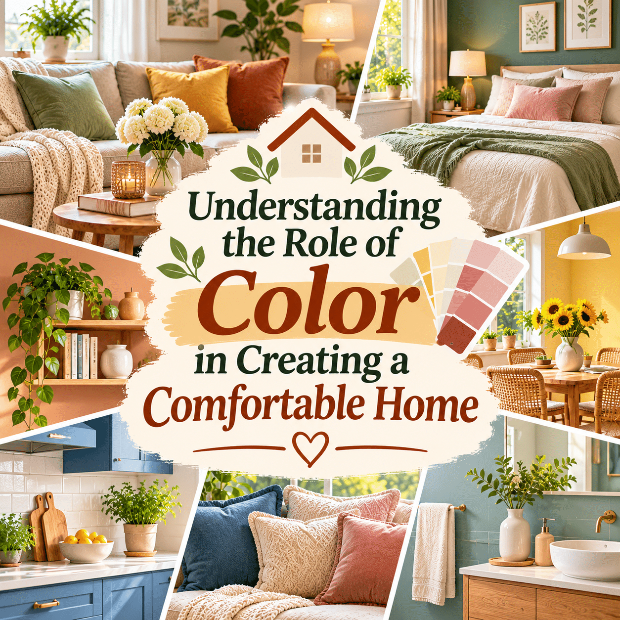
Color is one of the most influential visual elements in a home. It shapes the appearance of rooms, highlights architectural features, complements furniture, and helps create an atmosphere that reflects the people who live there.
From the warmth of soft beige walls to the freshness of muted green accents, color can change how a space is perceived. A room may appear brighter, more intimate, more energetic, or more understated depending on the colors used and the way they interact with lighting, materials, and surrounding furnishings.
However, creating a comfortable home through color is not simply a matter of choosing shades traditionally described as calming or cheerful. Color preferences are highly personal, and the experience of a particular shade can vary according to culture, memories, lighting conditions, and individual taste.
A successful home color scheme considers both appearance and everyday function. The colors of walls, flooring, furniture, textiles, and decorative accessories should work together without making rooms difficult to use or maintain.
Color also offers flexibility. Homeowners and renters can introduce meaningful changes through cushions, curtains, artwork, bedding, and other relatively simple additions without committing to expensive renovations.
Understanding how color works in interior spaces makes it easier to create rooms that feel welcoming, practical, visually balanced, and personally meaningful.
The following ideas explore the role of color in everyday home comfort and offer practical approaches for choosing, combining, and maintaining colors throughout different living spaces.

1. Color Helps Establish the Overall Atmosphere of a Home
One of the first things people notice when entering a room is its overall color palette.
Walls, furniture, flooring, and decorative objects work together to create a visual impression.
A room dominated by warm neutrals may appear soft and understated, while a space with bold contrasting colors may feel more visually expressive.
Neither approach is inherently more comfortable.
The most successful atmosphere is one that suits the room’s purpose and the preferences of its residents.
Before choosing colors, consider how the space is used and what kind of visual environment would make those activities enjoyable.
2. Personal Color Preferences Matter More Than Universal Rules
Interior design advice often associates specific colors with particular emotions.
Blue may be described as peaceful, yellow as cheerful, and green as refreshing.
These associations can provide inspiration, but they are not universal psychological rules.
Individual experiences, cultural influences, and personal memories affect how colors are perceived.
Someone may find a deep blue bedroom comforting, while another person prefers warm cream or soft terracotta.
A comfortable home should reflect genuine preferences rather than follow rigid assumptions about how colors are supposed to make people feel.
3. Warm Colors Can Create a Welcoming Visual Impression
Warm colors include shades of red, orange, yellow, and many earthy variations.
Terracotta, caramel, warm beige, and muted peach are often used to create inviting interiors.
These colors can work particularly well with natural wood, woven materials, and soft textiles.
A warm palette does not have to be intense.
Subtle accents, such as rust-colored cushions or a warm-toned rug, may be enough to introduce visual warmth.
The key is balancing these colors with surrounding surfaces so the room remains comfortable for everyday use.
4. Cool Colors Can Create a Fresh and Understated Appearance
Cool colors commonly include blue, green, and certain violet shades.
Soft sage, muted blue, and blue-gray are popular choices for interiors that emphasize a gentle visual atmosphere.
These shades can complement white, natural wood, and neutral fabrics.
However, the way a cool color appears depends heavily on lighting.
A pale blue wall may look fresh in a bright room but appear gray or subdued under different lighting conditions.
Testing samples in the intended space helps determine whether the result matches personal expectations.
5. Neutral Colors Provide a Flexible Foundation
Neutral colors are widely used because they can coordinate with many furniture styles and accent shades.
Common examples include white, cream, beige, taupe, gray, and certain earthy browns.
A neutral foundation makes it easier to change decorative accessories without repainting an entire room.
For example, a cream sofa can work with green cushions, rust-colored throws, or blue patterned textiles.
Neutral interiors do not have to feel plain.
Different textures, materials, and subtle variations in tone can create visual depth.
6. White Can Make Interiors Appear Bright and Simple
White is often chosen for walls and ceilings because it reflects a relatively large amount of visible light.
In rooms with suitable daylight, white surfaces may contribute to a brighter appearance.
However, not all whites look the same.
Some have warm undertones, while others appear cooler or more neutral.
The surrounding furniture, flooring, and lighting influence how these differences are perceived.
Pure white is not automatically the best choice for every home.
Softer off-white shades may coordinate more comfortably with warm materials and existing furnishings.
7. Beige and Cream Offer Gentle Alternatives to White
Beige and cream are useful when residents want a light interior without the appearance of stark white surfaces.
These shades often coordinate well with wooden furniture, natural textiles, and earthy accents.
They can provide a subtle background for artwork and personal decorations.
However, beige colors vary considerably.
Some contain yellow, pink, gray, or brown undertones.
Comparing samples beside existing flooring and furniture helps avoid unexpected combinations.
8. Gray Can Create a Balanced and Contemporary Interior
Gray is a versatile neutral that can range from pale silver to deep charcoal.
Light gray may provide a subtle background for colorful furnishings, while darker gray can introduce contrast.
The undertone matters.
Warm gray often contains beige or brown influences, while cool gray may lean toward blue.
A room filled entirely with similar gray surfaces may appear visually flat if there is little variation in texture or lighting.
Introducing wood, textiles, artwork, or carefully selected accent colors can create a more layered appearance.
9. Earthy Colors Connect Interiors With Natural Materials
Earth-inspired palettes include clay, sand, olive, rust, stone, and warm brown.
These colors often coordinate naturally with wood, ceramics, linen, and woven fibers.
An earthy palette can be especially useful for creating a consistent appearance across several rooms.
For example, warm beige walls, olive cushions, and terracotta accessories can share a related visual character.
Earthy colors can also be introduced gradually through small decorative objects.
They provide a flexible option for people who enjoy natural-looking interiors.
10. Green Can Introduce a Fresh, Nature-Inspired Character
Green is commonly associated with plants, gardens, and outdoor landscapes.
Interior shades range from pale sage to deep forest green.
Soft greens can work well as wall colors, while darker variations may provide contrast through furniture or accessories.
Green often pairs effectively with natural wood, cream, and warm neutral colors.
However, the shade should be evaluated under the room’s actual lighting.
A green that looks subtle in daylight may appear stronger or darker under artificial illumination.
11. Blue Can Add Visual Depth and Variety
Blue is available in a wide range of tones, from pale powder blue to deep navy.
Light blue may create an airy visual impression, while darker blue can make a room feel more enclosed and dramatic.
Blue can be combined with white, warm wood, beige, and metallic finishes.
In a bedroom, blue bedding or curtains may provide a simple way to experiment without repainting.
The most suitable shade depends on the surrounding materials and personal preferences.
A comfortable blue interior does not need to follow any particular decorating trend.
12. Yellow Can Bring Brightness and Personality
Yellow is often used to introduce a cheerful visual accent.
Soft butter yellow, muted mustard, and golden ochre offer different levels of intensity.
A small amount of yellow can stand out against neutral backgrounds.
Examples include a cushion, ceramic vase, framed print, or kitchen accessory.
Large areas of saturated yellow may feel visually intense to some people, particularly in brightly lit rooms.
Using softer shades or limiting stronger colors to accents can provide greater flexibility.
13. Terracotta and Rust Add Warmth Without Excessive Brightness
Terracotta and rust combine orange, red, and brown influences.
These colors can complement natural wood, woven baskets, greenery, and neutral upholstery.
They are useful for introducing warmth without relying on highly saturated red or orange.
A terracotta planter, rust-colored throw, or clay-toned artwork can become a focal point.
For a more cohesive appearance, repeat the accent in a few carefully selected locations.
Avoid adding too many competing warm shades unless the combination is intentional.
14. Pink Can Create Softness or Bold Contrast
Pink includes a broad range of colors, from pale blush to vivid fuchsia.
Muted pink can coordinate with beige, cream, gray, and natural wood.
Deeper pinks can introduce stronger contrast when used in small amounts.
Pink is not limited to bedrooms or decorative spaces.
It can appear in living rooms, dining areas, and home offices through textiles, artwork, or furniture.
The most important consideration is whether the shade suits the household’s taste and the room’s existing palette.
15. Dark Colors Can Make Rooms Feel Intimate and Distinctive
Deep green, navy, charcoal, and dark brown can create visually rich interiors.
Dark colors are sometimes avoided in small rooms because they absorb more light than pale surfaces.
However, this does not mean they are unsuitable for compact spaces.
A darker wall may provide a pleasing background for artwork or furniture.
Adequate lighting becomes particularly important when using deep shades.
Balancing darker surfaces with lighter furnishings and practical illumination can help maintain everyday usability.
16. Light Colors Can Influence the Perception of Space
Light-colored walls and ceilings generally reflect more light than darker alternatives.
This can make certain rooms appear brighter and visually more open.
However, perceived spaciousness also depends on furniture placement, room proportions, clutter, and lighting.
Painting a room white will not automatically make an awkward layout feel comfortable.
Use lighter colors as one part of a broader approach that includes practical furniture arrangements and appropriate storage.
17. Color Undertones Determine How Shades Work Together
Two colors may look similar at first but contain different undertones.
For example, one beige may lean toward yellow while another contains more pink or gray.
These differences can become noticeable when colors are placed beside each other.
Before selecting wall paint, compare samples with flooring, countertops, cabinetry, and large furniture pieces.
Observe the combinations under both daylight and artificial lighting.
Understanding undertones helps create a more consistent palette without requiring every surface to match exactly.
18. Natural Light Changes the Appearance of Color
Daylight varies in intensity and color throughout the day.
A wall may appear warmer in direct afternoon sunlight and more subdued during cloudy weather.
Window orientation, surrounding buildings, and seasonal changes also influence the result.
For this reason, paint samples should be tested in the room where they will be used.
Observe them during morning, afternoon, and evening conditions.
A color that looks attractive in a store may appear noticeably different at home.
19. Artificial Lighting Also Changes Color Perception
Light bulbs differ in color temperature and color-rendering characteristics.
Warm-toned lighting may emphasize certain yellows and reds, while cooler lighting can change the appearance of surrounding surfaces.
Color rendering is especially important when accurate color perception matters.
Before finalizing a room palette, evaluate samples under the artificial lighting normally used there.
A living room that looks balanced during the day should also feel pleasant in the evening.
Lighting and color should be planned together rather than treated as separate decisions.
20. Color Contrast Helps Define Different Areas
Contrast occurs when colors differ in brightness, saturation, or hue.
It can help distinguish furniture from walls, highlight architectural features, and create visual interest.
For example, a dark wooden table against a light wall may become a natural focal point.
Contrast can also improve the visibility of important household elements.
Door handles, stair edges, and switches may be easier to identify when they stand out from surrounding surfaces.
In homes where accessibility is important, practical visibility should take priority over decorative uniformity.
21. A Consistent Color Palette Creates Visual Continuity
Using related colors across different rooms can make a home feel more visually connected.
This does not require painting every room the same shade.
Instead, repeat a few foundational colors through flooring, trim, furniture, or accessories.
For example, cream, warm wood, and muted green might appear in different proportions throughout the home.
Each room can still have its own personality.
Visual continuity is particularly useful in open-plan homes where several areas can be seen at once.
22. Accent Colors Add Personality Without Major Changes
Accent colors are shades used in smaller amounts to create visual interest.
They may appear through cushions, artwork, lamps, rugs, or decorative accessories.
A neutral living room can change noticeably when new accent colors are introduced.
This makes accents useful for renters or anyone who prefers not to repaint frequently.
Choose accents that complement existing furniture and surfaces.
A few intentional details often create a clearer visual effect than numerous unrelated colors.
23. The 60-30-10 Approach Can Help Beginners
A commonly used interior design guideline divides a palette into approximate proportions.
The approach suggests:
- 60% dominant color.
- 30% secondary color.
- 10% accent color.
For example, a living room might use cream walls as the dominant color, natural wood and beige furniture as secondary elements, and sage green accessories as accents.
These percentages are not scientific requirements.
They are simply a planning tool that can help beginners think about visual balance.
Personal preferences and room conditions should always guide the final arrangement.
24. Monochromatic Palettes Can Create a Cohesive Appearance
A monochromatic color scheme uses variations of one main hue.
For example, a green-based room might combine pale sage, olive, and deep forest green.
The shades differ in brightness and intensity while maintaining a related appearance.
Texture becomes especially important in monochromatic interiors.
Wood, woven fabrics, ceramics, and upholstery can prevent the room from appearing visually flat.
A monochromatic scheme works best when the variations are deliberate rather than identical.
25. Complementary Colors Can Introduce Lively Contrast
Complementary colors are located opposite each other on a traditional color wheel.
Examples include blue and orange or red and green.
These combinations can create noticeable visual contrast.
However, using highly saturated versions in equal amounts may feel overwhelming in some interiors.
Muted variations often provide a more understated result.
For example, navy blue paired with terracotta can create contrast without requiring bright orange.
Color-wheel relationships are useful tools, but they do not replace personal judgment.
26. Analogous Colors Can Create Gentle Transitions
Analogous colors sit near each other on the color wheel.
Examples include blue, blue-green, and green.
These combinations often share visual characteristics, making them useful for coordinated interiors.
A room might combine muted teal cushions, sage green accessories, and soft blue artwork.
Variation in brightness and texture helps distinguish the elements.
Analogous schemes can be a practical starting point for people who want several colors without strong contrast.
27. Wall Color Should Complement Large Furniture
Large furniture pieces occupy significant visual space.
Sofas, beds, dining tables, and cabinets often influence the overall palette more than small accessories.
Before repainting, consider the colors and materials of existing furniture.
A warm wooden dining table may coordinate differently with cool gray walls than with cream or muted green.
Because large furniture is often expensive to replace, it is usually practical to build the color scheme around pieces that will remain.
This approach can reduce unnecessary purchases.
28. Flooring Color Influences the Entire Room
Flooring covers a large area and affects how other colors appear.
Warm wooden floors may emphasize the warmth of beige, terracotta, and olive shades.
Cool gray flooring may create a different visual relationship with the same wall colors.
When choosing paint, observe samples near the floor rather than only at eye level.
Rugs can also introduce color and texture without changing permanent flooring.
A cohesive room considers walls, floors, and furniture as connected elements.
29. Ceiling Color Can Change Visual Proportions
Ceilings are often painted white, but other colors can create different visual effects.
A light ceiling may help reflect available light.
A darker ceiling can introduce contrast and make the upper portion of a room feel more visually defined.
Using the same color on walls and ceilings may create a continuous appearance.
However, the result depends on room proportions, lighting, and architectural details.
Ceiling color should be chosen according to the overall design rather than a rigid rule.
30. Bedroom Colors Should Reflect Personal Rest Preferences
Bedrooms are personal spaces where comfort and privacy are especially important.
Some people prefer pale neutrals, while others enjoy darker or more expressive palettes.
There is no single bedroom color proven to guarantee restful sleep.
Practical factors such as bedding comfort, temperature, noise, and light control remain important.
Color can contribute to a pleasant atmosphere, but it should support rather than replace these essentials.
For a flexible approach, begin with neutral walls and introduce preferred colors through bedding or curtains.
31. Living Room Colors Should Support Different Activities
Living rooms often serve multiple purposes, including conversation, relaxation, entertainment, and reading.
A flexible palette can accommodate these activities without requiring frequent changes.
Neutral foundations combined with personal accents are one option.
However, bold or dark living rooms can also be comfortable when lighting and furniture are suitable.
Consider how the room looks during both daytime and evening use.
The goal is to create a setting that feels welcoming to the people who spend time there.
32. Kitchen Colors Should Balance Appearance and Practicality
Kitchen color choices involve walls, cabinetry, countertops, appliances, and accessories.
Because these surfaces are used frequently, durability and cleaning requirements matter.
Light cabinets may create a bright appearance, while darker cabinetry can introduce contrast.
Colorful accessories offer an inexpensive way to personalize the space.
Before selecting finishes, consider how easily stains, fingerprints, and wear will be visible.
A comfortable kitchen should be visually appealing without becoming unnecessarily difficult to maintain.
33. Dining Room Colors Can Complement Everyday Gatherings
Dining areas benefit from colors that work well with furniture, lighting, and the surrounding rooms.
Warm neutrals, natural wood, and muted accents are common combinations.
However, deeper colors can also create an inviting dining atmosphere.
Table linens, placemats, cushions, and centerpieces provide flexible ways to introduce color.
Avoid decorative arrangements that interfere with serving meals or conversation.
The best palette supports comfortable dining rather than demanding constant styling.
34. Bathroom Colors Should Work With Moisture-Resistant Materials
Bathrooms often include permanent finishes such as tiles, countertops, and fixtures.
These elements should guide the color palette.
White, beige, gray, and muted green are common choices, but personal preferences may support other combinations.
Lighting is particularly important because bathrooms are used for grooming and other detailed tasks.
Paint and finishes must also be suitable for the room’s moisture conditions.
Color alone cannot address poor ventilation or persistent dampness.
Practical maintenance should remain a priority.
35. Home Office Colors Should Support Visual Comfort
Home offices require appropriate lighting, practical furniture, and manageable visual distractions.
Wall color can contribute to the workspace’s appearance, but it should not interfere with visibility.
Highly reflective finishes may create glare in certain lighting conditions.
A neutral background with selected accents can provide flexibility.
People who enjoy expressive colors may prefer a stronger palette.
The best choice depends on work habits, personal preferences, and the room’s lighting.
36. Children’s Rooms Benefit From Flexible Color Choices
Children’s preferences may change as they grow.
A flexible color scheme can accommodate these changes without requiring frequent renovations.
Neutral walls combined with colorful bedding, artwork, and storage accessories are one practical approach.
Older children may enjoy participating in color decisions.
Safety, furniture stability, and age-appropriate organization remain more important than decorative themes.
Choose finishes that are suitable for the room and easy to maintain.
37. Entryway Colors Create the First Visual Impression
The entryway introduces the home’s overall style.
Its colors can provide continuity with adjoining rooms.
A light palette may help a narrow entrance appear brighter, while a deeper accent color can create visual interest.
Because entryways experience frequent traffic, durable and cleanable finishes are useful.
Storage, lighting, and clear walking paths remain essential.
A welcoming entrance combines visual character with everyday convenience.
38. Seasonal Color Changes Can Refresh a Home Affordably
Color offers an easy way to introduce seasonal variety without major purchases.
Changing cushion covers, table linens, or decorative arrangements can alter the appearance of a room.
Warm earthy accents may appeal during cooler periods, while lighter textiles may feel suitable in warmer seasons.
These associations are preferences rather than requirements.
Seasonal changes should use existing belongings where possible.
A comfortable home does not need frequent redecorating to remain enjoyable.
39. Color Choices Should Consider Long-Term Maintenance
Paint, upholstery, rugs, and decorative finishes experience wear over time.
Some surfaces show stains, scratches, or dust more readily than others.
The visibility of wear depends on color, material, texture, and lighting.
Before choosing finishes, consider household activities, pets, children, and cleaning routines.
Durable materials and practical maintenance may be more valuable than following a temporary color trend.
Long-lasting comfort comes from combining attractive colors with suitable everyday performance.
40. The Best Home Color Scheme Is One That Feels Personally Comfortable
There is no universal formula for the perfect home palette.
Some people enjoy calm neutrals, while others prefer bold contrasts, colorful collections, or richly layered interiors.
A successful color scheme should reflect personal taste while supporting the practical needs of each room.
Lighting, furniture, flooring, maintenance, and household routines all influence the result.
Rather than pursuing a fashionable appearance, focus on creating spaces that feel familiar, welcoming, and enjoyable over time.
Color is most effective when it contributes to a home that genuinely works for the people living there.
Understanding Different Color Families in Home Design
Color families provide useful starting points when developing an interior palette.
| Color Family | Common Visual Characteristics | Popular Home Applications |
|---|---|---|
| White and Off-White | Bright, simple, versatile | Walls, ceilings, cabinetry |
| Beige and Cream | Warm, gentle, understated | Living rooms, bedrooms, upholstery |
| Gray | Neutral, flexible, contemporary | Walls, furniture, flooring |
| Brown and Wood Tones | Earthy, natural, visually warm | Furniture, flooring, decorative accents |
| Green | Nature-inspired, fresh, varied | Bedrooms, living rooms, plants, accessories |
| Blue | Ranges from airy to deep and dramatic | Bedrooms, offices, textiles |
| Yellow | Bright, expressive, warm | Kitchens, artwork, small accents |
| Terracotta and Rust | Earthy, warm, distinctive | Cushions, rugs, ceramics |
| Pink | Ranges from soft to vivid | Bedrooms, living areas, accessories |
| Dark Neutrals | Rich contrast and visual depth | Accent walls, cabinetry, furniture |
These descriptions reflect common design associations, not guaranteed emotional responses.
How to Choose a Comfortable Home Color Palette Step by Step
Choosing colors becomes easier when decisions follow a practical sequence.
Step 1: Identify the Room’s Main Purpose
Consider whether the room is primarily used for sleeping, cooking, working, relaxing, or socializing.
Its function should guide practical design decisions.
Step 2: Observe Existing Lighting
Examine the room during different times of day.
Notice whether natural light is abundant, limited, warm, or affected by surrounding buildings.
Step 3: Review Permanent Features
Consider flooring, cabinetry, countertops, tiles, and architectural finishes.
These elements often remain unchanged for years.
Step 4: Select a Main Color
Choose a foundation that complements the room’s existing materials.
This may be a neutral shade or a more expressive color.
Step 5: Add Supporting Colors
Select one or two related shades to create variety.
Use furniture, textiles, and artwork to introduce them.
Step 6: Consider Accent Colors
Choose small accents that provide visual interest without overwhelming the space.
Step 7: Test Samples in the Actual Room
Paint sample areas or use movable sample boards.
Observe them under natural and artificial lighting.
Step 8: Evaluate Practical Maintenance
Consider cleaning requirements, durability, and the household’s daily activities.
Step 9: Make Changes Gradually
Begin with accessories or a limited painted area before committing to major changes.
Step 10: Live With the Results
Allow time to experience the colors during normal routines.
Adjust the palette if it does not feel comfortable in everyday use.
Practical Color Combinations for Different Home Styles
The following combinations provide inspiration rather than fixed rules.
| Interior Style | Main Colors | Accent Colors | Overall Appearance |
|---|---|---|---|
| Warm Minimalist | Cream, beige, warm white | Natural wood, muted brown | Simple and inviting |
| Nature-Inspired | Sage green, cream | Olive, terracotta | Earthy and fresh |
| Modern Neutral | Soft gray, off-white | Charcoal, warm wood | Balanced and contemporary |
| Coastal-Inspired | White, pale blue, sand | Natural textures, muted navy | Light and airy |
| Rustic Comfort | Warm beige, brown | Rust, olive, clay | Natural and layered |
| Soft Contemporary | Greige, cream | Muted pink, sage | Gentle and understated |
| Bold Modern | Charcoal, white | Mustard, terracotta | High-contrast and expressive |
| Traditional Warmth | Ivory, wood tones | Deep green, burgundy | Rich and familiar |
| Scandinavian-Inspired | Warm white, pale gray | Light wood, muted blue | Bright and simple |
| Eclectic Personal | Flexible neutral foundation | Multiple curated accents | Individual and expressive |
Any of these palettes can be adapted to suit different room sizes, lighting conditions, and personal preferences.
Budget-Friendly Ways to Introduce Color at Home
A color refresh does not always require repainting or purchasing new furniture.
No-Cost Ideas
- Rearrange existing decorative accessories.
- Move artwork between rooms.
- Group objects with related colors.
- Change the placement of cushions and throws.
- Display books or personal collections in coordinated arrangements.
- Reconsider how existing colors interact with daylight.
- Remove decorations that no longer suit the room.
Low-Cost Ideas
- Replace cushion covers.
- Add a small decorative textile.
- Introduce colorful planters.
- Update framed prints.
- Paint a small piece of suitable furniture.
- Add coordinating kitchen or dining accessories.
- Refresh a limited wall area with appropriate paint.
Larger Improvements
- Repaint an entire room.
- Refinish cabinetry.
- Replace worn upholstery.
- Upgrade flooring.
- Change major window treatments.
- Introduce new furniture that better suits the existing palette.
Before making larger purchases, consider whether simpler adjustments could achieve the desired result.
Common Color Mistakes That Can Reduce Home Comfort
Choosing Paint Without Testing It
Paint colors can look different under various lighting conditions.
Always evaluate samples in the intended room.
Ignoring Existing Flooring and Furniture
A new wall color may clash with permanent surfaces.
Consider the complete environment before selecting a shade.
Following Trends Without Considering Personal Preferences
A fashionable color may not remain enjoyable over time.
Choose colors that reflect genuine taste.
Using Too Many Strong Accents Without a Clear Plan
Multiple competing colors can make the visual composition difficult to understand.
Create balance through repetition and thoughtful placement.
Assuming All Neutrals Match
Neutral shades have different undertones.
Compare samples carefully.
Forgetting Artificial Lighting
A room’s appearance changes after sunset.
Evaluate colors under the lighting used during normal evening routines.
Prioritizing Appearance Over Maintenance
Some materials and finishes may require more upkeep than expected.
Choose practical options for frequently used spaces.
Treating Every Room Independently
Unrelated palettes can create abrupt visual transitions in connected spaces.
Consider a few shared colors to establish continuity.
Using Color as a Substitute for Functional Improvements
A new paint color cannot solve uncomfortable seating, poor ventilation, or inadequate lighting.
Address essential comfort needs alongside decorative decisions.
A Practical Home Color Planning Checklist
Use this checklist before making major color changes.
Personal Preferences
- The palette reflects the residents’ tastes.
- Colors suit the room’s intended activities.
- The scheme feels enjoyable during everyday use.
- Household members’ preferences have been considered.
- The design is not based entirely on temporary trends.
Lighting and Existing Features
- Paint samples have been observed in natural light.
- Colors have been checked under artificial lighting.
- Flooring and furniture undertones have been considered.
- Glare and room brightness are appropriate.
- Permanent fixtures coordinate with the palette.
Visual Balance
- The room has a clear main color.
- Supporting colors complement the foundation.
- Accent colors are used intentionally.
- Textures provide visual variety.
- Connected rooms have a reasonable sense of continuity.
Practical Maintenance
- Finishes are suitable for the room.
- Cleaning requirements are manageable.
- Materials are appropriate for household activities.
- Larger purchases fit the available budget.
- The palette can adapt to future changes.
This checklist is intended to support thoughtful choices rather than impose a particular decorating style.
Frequently Asked Questions About Color and Home Comfort
1. How does color influence the comfort of a home?
Color influences the visual appearance of rooms, affects how surfaces interact with light, and contributes to the atmosphere of a space. Personal preferences and surrounding conditions determine how comfortable a particular palette feels.
2. What colors make a home feel cozy?
Warm neutrals, earthy browns, muted greens, and terracotta are commonly used in cozy interiors. However, comfort is subjective, and darker or cooler colors can also create welcoming spaces.
3. Are neutral colors always the best choice?
No. Neutral colors are versatile, but they are not automatically more comfortable than colorful interiors. The best choice depends on personal taste, room function, and existing furnishings.
4. Can color make a small room appear larger?
Light-reflecting surfaces may help a room appear brighter and visually more open. However, furniture arrangement, lighting, and clutter also influence the perception of space.
5. Which colors are best for bedrooms?
There is no universal best bedroom color. Many people prefer soft neutrals or muted shades, while others enjoy deeper colors. Choose a palette that supports personal comfort and works with the room’s lighting.
6. How do I choose colors for a living room?
Start with existing furniture, flooring, and lighting. Select a main color that coordinates with these elements, then introduce supporting and accent shades according to personal preferences.
7. What is the difference between warm and cool colors?
Warm colors generally include reds, oranges, yellows, and related earthy tones. Cool colors commonly include blues, greens, and certain violets. Their appearance also depends on undertones and surrounding colors.
8. How many colors should I use in one room?
There is no fixed number. A main color with one or two supporting shades and selected accents is a practical starting point, but more complex palettes can also work when thoughtfully arranged.
9. What is the 60-30-10 color rule?
It is a design guideline suggesting approximately 60% dominant color, 30% secondary color, and 10% accent color. It can help organize a palette but does not need to be followed precisely.
10. How does natural light affect paint colors?
Natural light changes in intensity and color throughout the day, influencing how paint appears. Window orientation, season, and surrounding surfaces also affect the result.
11. Can dark colors work in small rooms?
Yes. Dark colors can create visually rich interiors, even in compact spaces. Appropriate lighting, furniture scale, and contrast are important for maintaining usability.
12. How can I add color without painting?
Use cushions, curtains, rugs, artwork, bedding, planters, and decorative accessories. These elements can introduce color without permanent changes.
13. Should every room have the same color palette?
No. Rooms can have distinct personalities while sharing a few related colors or materials. This creates continuity without requiring identical designs.
14. How can I choose colors that will remain attractive over time?
Focus on personal preferences, practical maintenance, and compatibility with existing furniture. Use flexible accessories for colors you may want to change more frequently.
15. What is the most important rule when choosing home colors?
Choose colors that support the room’s function and feel comfortable to the people living there. Visual balance, suitable lighting, and everyday practicality matter more than following a particular trend.
Final Thoughts
Color plays an important role in creating a comfortable home because it influences how spaces look, how materials interact, and how residents experience their surroundings.
From soft neutrals and earthy shades to bold accents and deep contrasting colors, every palette offers different possibilities for personal expression.
However, color comfort is not determined by universal formulas. Individual preferences, natural and artificial lighting, existing furniture, room function, and maintenance requirements all influence whether a particular combination works well.
A thoughtful approach begins with understanding the home as it already exists. Rather than making dramatic changes immediately, residents can experiment with samples, adjust accessories, and observe how colors feel during everyday activities.
Small improvements can often create meaningful visual changes without expensive renovations.
Ultimately, the best color scheme is not necessarily the most fashionable or carefully coordinated. It is one that reflects personal taste, supports practical living, and makes the home feel welcoming and enjoyable over time.
By choosing colors with intention and flexibility, it becomes possible to create living spaces that remain comfortable, expressive, and meaningful through the changing seasons and stages of everyday life.